
Looks matter. Especially the looks of your business website, because you can’t be everywhere everytime and attract customers with your wit. That is why, business ventures should add that extra element of graphic designs in their websites. Graphical designs help make business websites better. In fast paced world, people appreciate visual contents that carry all the information but in simpler terms. Thus, graphic designs never go out of fashion and are crowd pullers.
Knowing the latest trends in graphic trends and utilising them helps make the business better and reachable to masses. The clients can resonate better with their needs when the designs are updated to the changing environmental scenarios which depicts the needs and expectations of consumers.
Top graphic trends to look for in 2019 and beyond are:
-
Bold colors
Bold colors attract human eyes easily. They nullify distractions and turn the attention of the users even before one realises it. Any data that is written in bold or amongst bold color palettes gets noticed easily. Because of the high impact it creates, bold color designing tops the list.
Colors which are compatible and belonging to the same color palette are usually preferred. There might be exceptions too. In such cases, it is carefully noted not to make the colors too bright and to keep the other elements small.
For instance,
In the above design, the red and orange belong to the same color palette whereas the others aren’t and that is why they are muted down to achieve better visual effect. Generally, the color black or white is added to tone down the colors.
-
Keep it moving
Static graphic designs are so old news. A few years back, business websites used to have boring styles. The pages used to open one after another abruptly without any smoothness in between. Even such minute details make much differences.
Now, the websites are constructed in slides and it makes navigating through these websites more visually pleasing. The illusion of moving is created to achieve an attractive and catchy impact. Graphic designers have started playing with the sharpness of colors, text and other elements to make one stand out from the other. Such a detail which can’t be noticed by common eye is as trivial as it comes.

-
Asymmetric patterns
Sometimes texts or animations alone can’t bring forth all the necessary information. Asymmetric patterns come to the rescue by carrying some meaning with them that words lack in an artistic way. They bridge the gap between graphic designs and illustrations, fusing them together. Besides focusing on target audiences, shapes, lines illustrate necessary points to attract the leftover audiences, graphic design brings out the artistic side of the individual.

The above image is a beautiful example of using asymmetrical pattern in graphical designs. It lets the user decide which part they are focusing at current point of time while dividing and zoning out the others. It also lets the designer compile more information in limited space without crowding them.
-
Isometry
Much similar to using asymmetrical patterns, isometric graphics also serve more purposes than any other trends. Isometry is a concept many people might not be aware of. Basically it is used to map points from one space to another, while keeping the distance between points same as before. The idea of isometry is playing with optical illusions. It is used in graphic designing to create a grandeur and a long lasting effort.

Image source: 99Designs
For example, in the above design, the designer has used up a little amount of space to include as much data as possible. It doesn’t look congested and is still cool on the eyes.
As a growing trend, three-dimensional images are being converted into two-dimensional ones, as we speak of now.
-
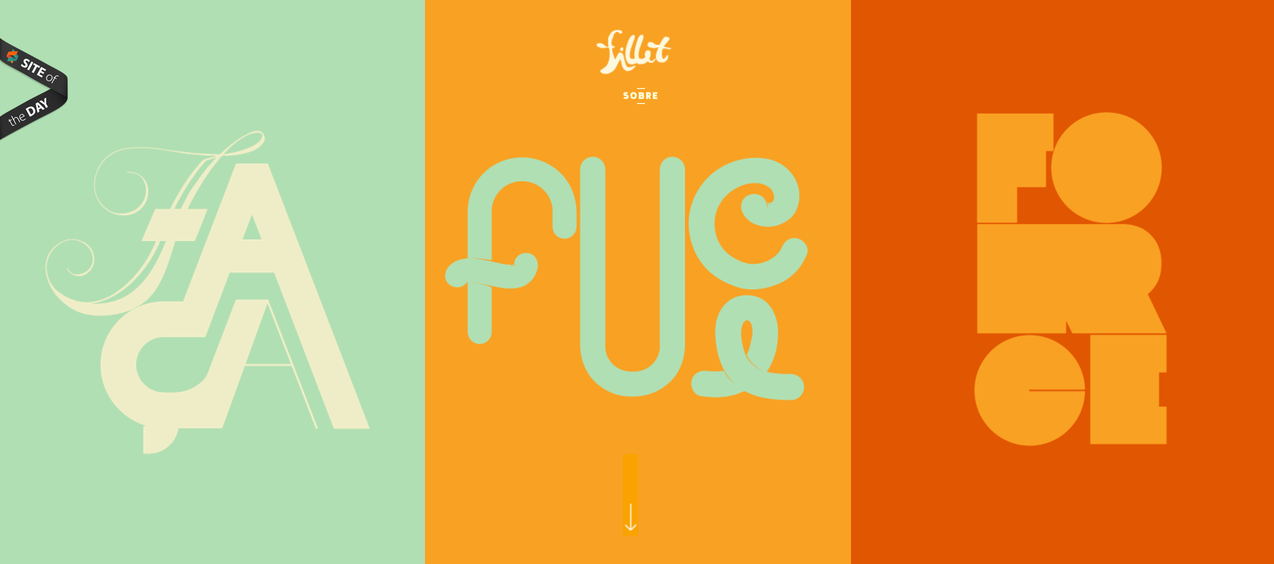
Serif fonts
It is considered worldwide that Serif font is used to create an emphasis on normal texts. The truth is sans serif fonts (i.e fonts that aren't Serif) can lack in being more visually clear or accurate. Generally, while skimming or being in a hurry, one can mistake from letters that could look the same. For example, the letters ‘b’ and ‘d’. The serif font is included to nullify this error and as the graphic trends evolve, it is a must that typography should improve without being left behind.
Image source: Bashooka.com
The above design might look as simple as it gets. But it sure creates an everlasting impact without our knowledge. One can’t help but stop and take a look at this.
-
Abstracts and dreamy illustrations

Image source: Thinkstock
The above graphic design could be one of the best abstract designs one could have witnessed. It describes the purpose of the website all in one go without even using words. Using dreamy illustrations in creating graphic designs is the new trend of 2019. These illustrations take the user beyond dimensions as they provide much better impact than animations or videos. They open the doors to another type of virtual reality and the biggest advantage of using them is that they leave their footprint in the human mind.
There are many other trends evolving in 2019 which might go outdated in a span of time. But these trends look like they are here to stay. 2019 is the year of evolution and shedding old self and these trends depict that motto.